ggplot2
ggplot2 is a visualization package included in the tidyverse. It follows the Grammar of Graphics (GoG), which involves building graphs from the following components:
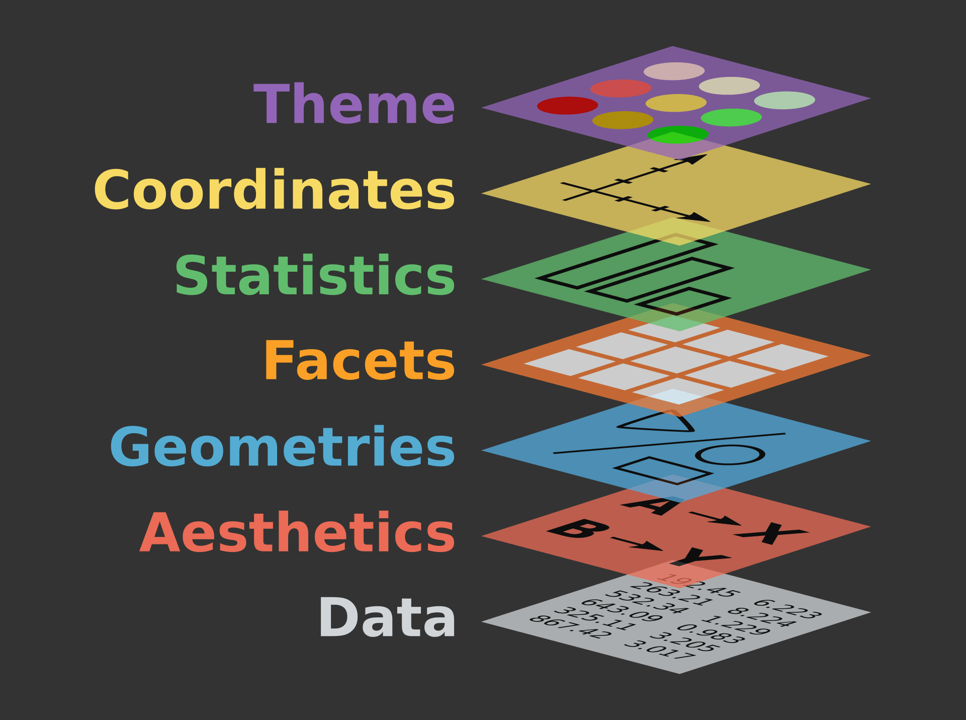
Image from The Grammar of Graphics by Leland Wilkinson
Check out the ggplot cheatsheet.
Elements in ggplot2 funtions
The vocabulary of ggplot can be difficult to parse at first. Here are the essential components:
Aesthetics: Visual properties of the objects in your plot, e.g. axis of data, size, shape, color, pattern, fill of variables, alpha
Geoms: Geometric objects representing data, such as lines, bars, points
Facets: Subgrouping of data
Statistics: Additional functions like regression lines
Scales: Legends and labels
Coordinate System: Cartesian, polar, etc.
Themes: Background visuals
Install/load tidyverse
The very first time you want to use a package you first need to install it.
# if you have never downloaded tidyverse uncomment the line below and run to install it
install.packages('tidyverse')
# load tidyverse
library(tidyverse)
We will do a similar step with our penguin data that we will be visualizing.
install.packages("palmerpenguins")
library(palmerpenguins)
We use the View() function to look at the data frame and check that
we have tidy data: each variable is a column and each observation is a
row.
View(penguins)
Building layers
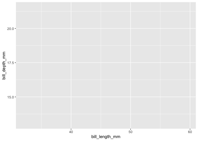
Let’s start by laying the foundations of our plot with the ggplot()
function. We add in our data, letting us create a blank plot.
ggplot(data=penguins)

Now we need to add aesthetics and geometric objects. Aesthetics are what
you plot (x, y, size, color, fill, shape), and geoms are how you plot
aesthetics (point, line, bar, boxplot). We specify aesthetics in
aes().
Here, we set up axes to show the relationship between the variables
bill_length_mm and bill_depth_mm. The data will still not be
visualized, but the axes show the range of the data.
ggplot(data=penguins,aes(x=bill_length_mm,y=bill_depth_mm))
Now we can decide what kind of plot to make. Let’s start with a simple
scatter plot. We need to add the geom (geometry), which here is
geom_point().
ggplot(data=penguins,aes(x=bill_length_mm,y=bill_depth_mm))+
       geom_point()
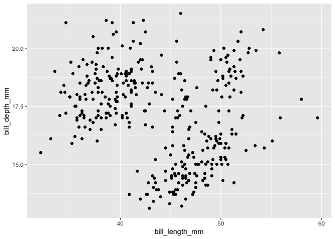
We can now see our data! However, it is difficult to see any pattern at the moment.
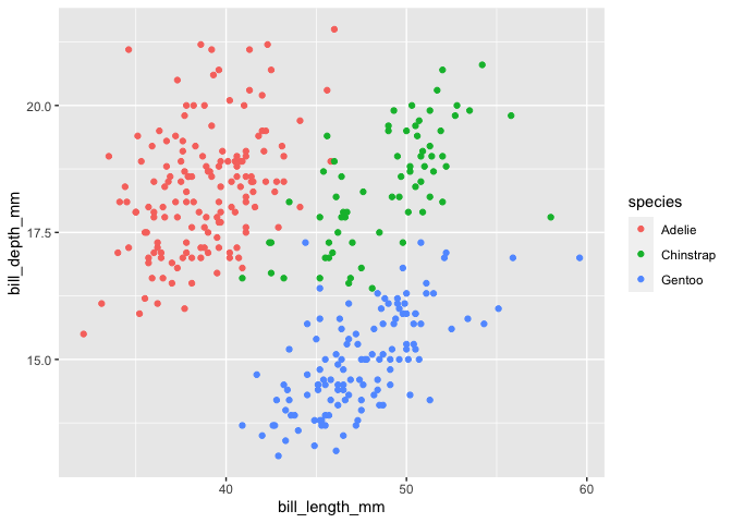
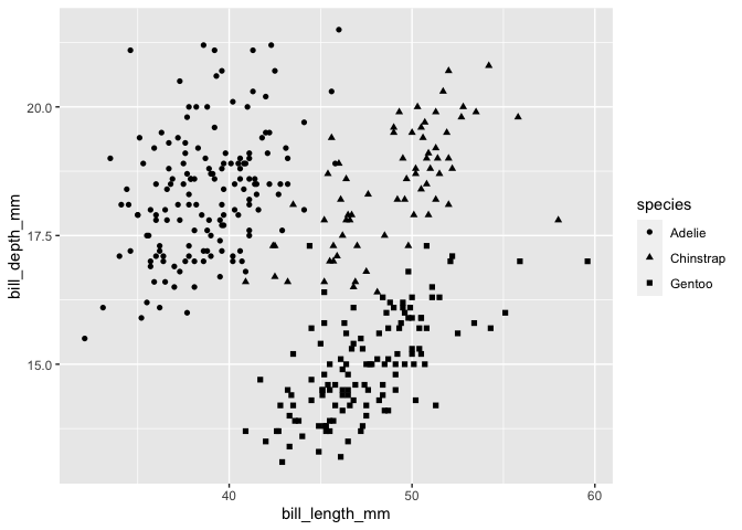
Let’s group together data from each species. We can do this by adding
color=species to the aes(), which gives each species its own
color. This will also create a legend.
ggplot(data=penguins,aes(x=bill_length_mm,y=bill_depth_mm, color=species))+
         geom_point()
In addition to color, you also add other aesthetics: fill, shape, linewidth, and alpha (transparency).
ggplot(data = penguins, aes(x = bill_length_mm, y = bill_depth_mm, shape = species)) +
   geom_point()
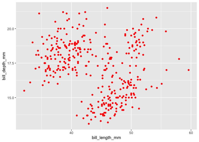
If we specify a color outside of aesthetics, such as within
geom_point(), every data point will be that color. We pick the
specific color in quotes.
ggplot(penguins, aes(x = bill_length_mm, y = bill_depth_mm)) +
   geom_point(color = "red")
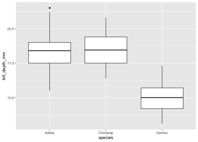
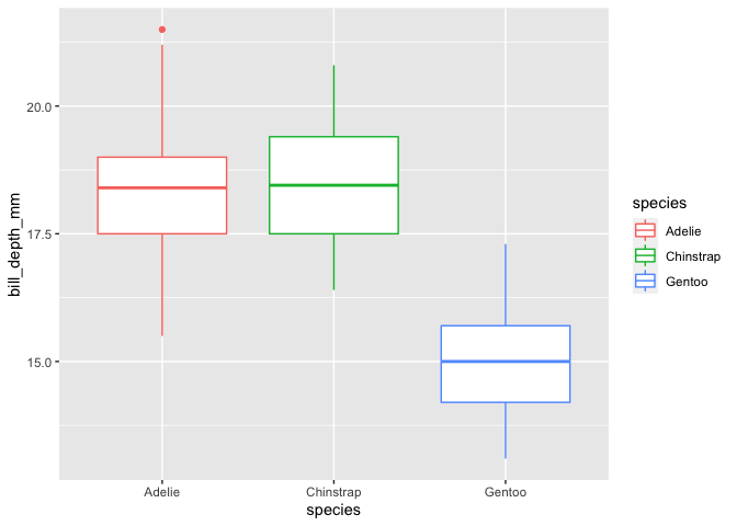
Let’s try making another type of plot. Here, we make a boxplot of bill
depth by species with geom_boxplot().
ggplot(data = penguins, aes(x = species, y = bill_depth_mm)) +
   geom_boxplot()
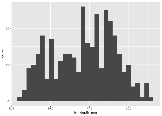
We can make a histogram of bill depth with geom_histogram.
ggplot(data = penguins, aes(x = bill_depth_mm)) +
   geom_histogram()
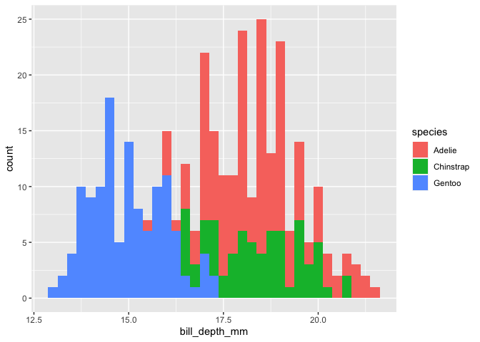
Like with our scatter plot, we can separate out species with color, here
specified with fill.
ggplot(data = penguins, aes(x=bill_depth_mm, fill=species)) +
   geom_histogram(binwidth = 0.25)
Facets
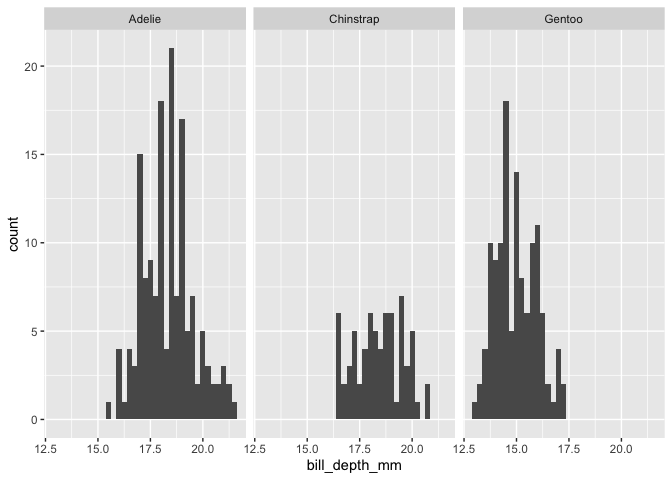
Another way to separate out groups is with facets. Facets are
essentially panels showing each group individually. We specify the
facets as their own layer in facet_wrap().
ggplot(data = penguins, aes(x = bill_depth_mm)) +
   geom_histogram(binwidth = 0.25) +
   facet_wrap(~ species)
Customizing our plot
ggplot has many options for customizing plots. We will go into the very basics of those options here.
We will start by saving a simple colored box plot to a variable named
myplot.
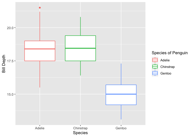
myplot<- ggplot(data = penguins, aes(x = species, y = bill_depth_mm, color = species)) +
   geom_boxplot()
myplot
Once the plot is saved as a variable, we can add axes labels with xlab() and ylab().
myplot+
   xlab("Species")+
   ylab("Bill Depth")
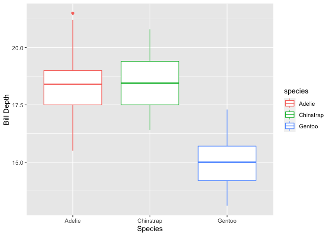
We can also change the title of the legend. Depending on various
factors, such as how you are distinguishing groups, there are different
functions for this. For this specific case, we use the function
scale_color_discrete().
myplot+
   xlab("Species")+
   ylab("Bill Depth")+
   scale_color_discrete(name="Species of Penguin")
Themes
The default theme in ggplot has a light gray background with a faint
grid. There are many other themes you can use in ggplot, such as
theme_minimal.
myplot+
   xlab("Species")+
   ylab("Bill Depth")+
   scale_color_discrete(name="Species of Penguin")+
      theme_minimal()
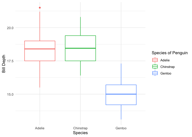
This is one of many pre-built themes available. It is also possible to make a custom theme.
If you would like to play with other pre-built themes, try the ggthemes package!
install.packages('ggthemes')
library(ggthemes)
+theme_tufte()
+theme_fivethirtyeight()
+theme_economist()
+theme_wsj()
+theme_solarized()
Saving plots
Finally, to save a plot, you can use the ggsave() function,
specifying the desired file name.
penguins_plot<-myplot+
   xlab("Species")+
   ylab("Bill Depth")+
   scale_color_discrete(name="Species of Penguin")+
      theme_minimal()

ggsave("penguins_plot.pdf", penguins_plot, device="pdf")
## Saving 7 x 5 in image
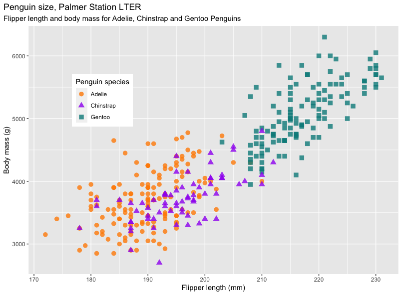
Challenge
Try to recreate the following plot from the penguins data set:
Solution
ggplot(data = penguins, aes(x = flipper_length_mm,y = body_mass_g)) +
   geom_point(aes(color = species,
                  shape = species),
                  size = 3,
                  alpha = 0.8) +
scale_color_manual(values = c("darkorange","purple","cyan4")) +
labs(title = "Penguin size, Palmer Station LTER",
      subtitle = "Flipper length and body mass for Adelie, Chinstrap and Gentoo Penguins",
      x = "Flipper length (mm)",
      y = "Body mass (g)",
      color = "Penguin species",
      shape = "Penguin species") +
theme(legend.position = c(0.2, 0.7),
      plot.title.position = "plot",
      plot.caption = element_text(hjust = 0, face= "italic"),
      plot.caption.position = "plot")